
A homeowner pulls your flyer out of the mailbox, glances at it for two seconds, and throws it away. That happens for a reason. The flyer is crowded, generic, or weak on proof. If your flyers keep getting binned, they're failing three basic tests. They don't stop the eye, they don't build trust fast enough, and they don't make the next step obvious.
Good cleaning service flyers are sales tools, not decoration. They need one job, one message, and one clear action. Local flyer campaigns still work when the targeting is tight and the offer is easy to understand, as noted earlier. Random drops with vague copy waste printing money.
This guide gives you eight flyer ideas you can effectively use. Each one comes with a practical mini-toolkit. You'll get a layout sketch, a headline formula, CTA examples, and a distribution angle so you can stop guessing and start testing what brings in calls.
Use these ideas to build flyers that get noticed, get kept, and get booked.
Table of Contents
- 1. Before & After Visual Comparison Flyer
- 2. Local Service Guarantee & Pricing Transparency Flyer
- 3. Seasonal Service Special & Limited-Time Offer Flyer
- 4. Customer Testimonial & Social Proof Flyer
- 5. Educational How-To & Service Explanation Flyer
- 6. Service Area Map & Local Coverage Flyer
- 7. Problem-Solution-Benefit Outcome Flyer
- 8. Mobile-First Interactive QR Code & Easy Booking Flyer
- 8-Point Cleaning Flyer Ideas Comparison
- Putting These Flyer Ideas into Action
1. Before & After Visual Comparison Flyer
A homeowner is scanning mail over the trash can. You have about two seconds to prove your cleaning service is worth a call. A before-and-after flyer does that fast. It shows the job, the result, and the standard you work to without asking the reader to study a wall of copy.
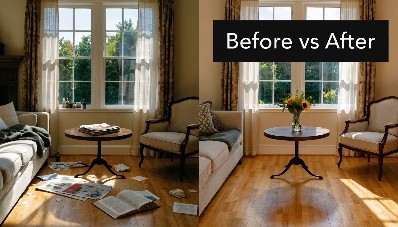
This format works best for services with visible contrast. Deep cleaning. Carpet cleaning. Tile and grout. Window cleaning. Post-construction cleanup. If the difference is obvious at a glance, put it front and center. If the result is subtle, use another flyer concept.
Layout that sells the result
Use a layout that makes the proof impossible to miss.
- Top: One hard-working headline
- Middle: A large before-and-after photo pair with matching angle, lighting, and crop
- Bottom: Business name, phone number, service area, and one CTA
- Corner badge: One trust marker such as Insured, Local, or Fast Quotes
Keep the page clean. The photo carries the sale. If your images look inconsistent, overedited, or obviously staged, the flyer loses credibility fast.
Use these headline formulas:
- See the difference a proper clean makes
- From buildup to spotless
- Proof, not promises
- Results you can see before you call
Here is the simple build that works on one page:
- Put BEFORE and AFTER labels directly on the images
- Add one short caption under the photo, such as Kitchen deep clean in [suburb]
- Use a CTA with one action only
- Add a QR code only if it leads to a gallery, quote form, or booking page that loads fast on a phone
Practical rule: Never place body text over the main image. If the result photo is the hook, protect it.
This flyer also needs the right distribution plan. Put it where people can compare the image from a few feet away. Community boards, apartment lobbies, real estate offices, mailbox drops in older neighborhoods, and handouts to property managers all fit. Skip crowded designs for these placements. Strong contrast and one message beat clever design every time.
CTA examples:
- Call for a fast quote
- Text us photos for pricing
- Scan to see more finished jobs
- Book your clean today
2. Local Service Guarantee & Pricing Transparency Flyer
A homeowner picks up your flyer and looks for two things right away. Can they trust you, and will the price turn into an argument later? If your flyer answers both in five seconds, it works.
This format is built for skeptical buyers. Use it when your market is crowded, your competitors play pricing games, or you want to win on trust instead of gimmicks. The job of this flyer is simple. Remove doubt, show how quoting works, and make the next step easy.
Layout sketch that gets read
Use a three-part layout with clear spacing.
- Top strip: Headline plus guarantee
- Middle section: How pricing works, in plain language
- Bottom section: Local proof, contact details, and one CTA
Do not cram in every service. This flyer sells certainty. Keep it focused.
A strong top section might say: Local team. Clear pricing. No runaround.
Under that, add one guarantee people care about, such as Fixed quote before work starts or We confirm the scope before we begin.
What to include on the flyer
Your middle section does the heavy lifting. Spell out the quote process in one or two lines.
- Flat-rate jobs: Price confirmed before we start
- Larger or custom jobs: On-site quote for larger work
- Recurring service: Clear visit rates with no surprise add-ons
That level of clarity gets more response than vague promises. If you want examples of ad angles that sell certainty and local trust, these pest control ad examples focused on clear offers and buyer intent are worth studying.
Then finish with local proof that feels real:
- Suburb names you serve
- Operating hours
- Licence or insurance details
- One short testimonial with a first name and suburb
- A real photo of the owner, crew, or van
Skip stock photos if you can. A local service guarantee flyer should look local.
Build one version per buyer
Do not mix residential and commercial offers on the same page. Insurance Canopy recommends separate flyers for each audience in its cleaning company flyer planning guide, and that advice is right. Homeowners want reassurance and a simple first-step offer. Commercial buyers care more about reliability, scope, and contract value.
Use that split on purpose.
- Residential version: first-service discount, simple quote language, family-home imagery
- Commercial version: bundled extra service time, scheduled site assessment, office or facility imagery
One flyer should speak to one buyer. Anything broader starts to look careless.
Headline formulas that fit this angle
Use short headlines that remove doubt fast:
- Know the cost before the work starts
- Clear quotes from a local cleaning team
- Booked appointments. Straight pricing.
- Reliable service for [suburb] homes and businesses
CTA examples that match the message
Your call to action should fit the promise of clarity.
- Call for a fixed quote
- Text us for same-day callback
- Book an on-site quote
- Ask about weekly service rates
If you cannot print an exact price, print the process. People will forgive custom quoting. They will not forgive vagueness.
A solid real-world version looks like this. Headline at the top. One sentence explaining the guarantee. A short pricing box that shows how quotes are handled. Then local proof and one contact action. Clean layout. Plenty of white space. No clutter. This is one of the easiest flyer formats to produce, and one of the strongest if your sales process depends on trust.
3. Seasonal Service Special & Limited-Time Offer Flyer
A homeowner sees your flyer two days before guests arrive. An office manager gets it right before staff return after school holidays. That timing does half the work. Your flyer just needs to make the next step obvious.
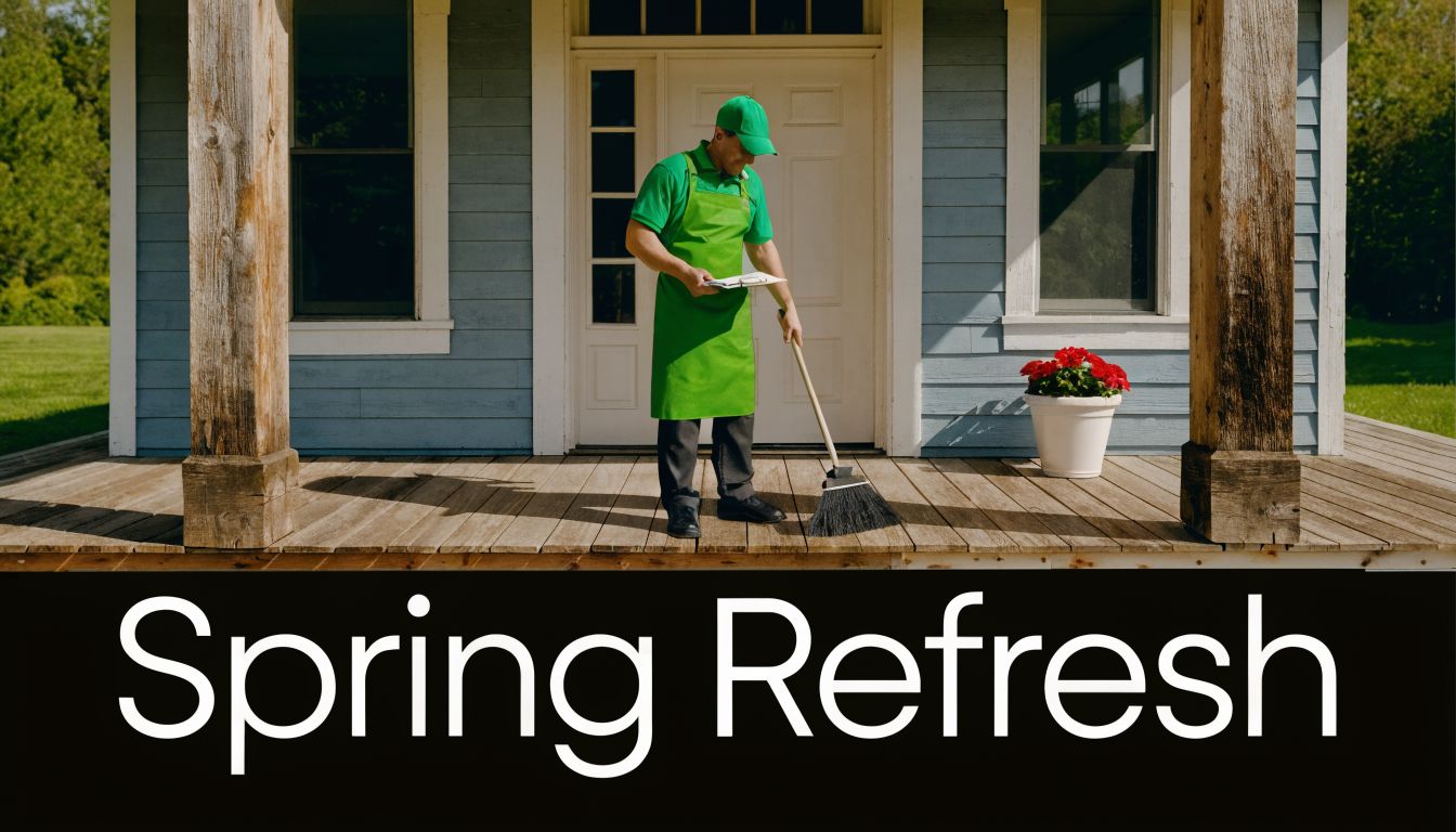
Seasonal flyers win when the offer matches a real job people already need done. Use spring deep cleans, end-of-lease rush periods, holiday hosting prep, post-storm cleanup, or back-to-school office resets. Skip vague promos that could run any month. They get ignored because they feel lazy.
Build the flyer around one timely job
Use a simple layout that pushes urgency without clutter:
- Top banner: season and offer
- Main block: what the service includes
- Side box: booking deadline or limited slots
- Bottom: CTA, phone, QR code, service area
That structure works because it answers the only questions that matter. Why now. What do I get. How do I book.
Here are headline formulas that fit this format:
- Spring cleaning bookings close Friday
- End-of-lease cleans available this week
- Holiday hosting clean. Limited spots left
- Book your pre-event clean before the rush
Your offer also needs a hard edge. Put a real deadline on it. Put the date in large type. “Ends 30 September” beats “limited time” every time.
Mini-toolkit for making this idea usable fast
A strong seasonal flyer can be built in 15 minutes if you keep the parts tight.
Layout sketch:
- top quarter for the seasonal headline
- middle half for one image and 3 service inclusions
- right or lower corner for the expiry date
- bottom strip for phone, QR code, and suburb list
Offer formulas:
- Book by [date] and get [bonus service]
- [Season] clean for [property type]. Limited weekly spots
- Priority booking for [specific problem] this month
- Reserve your [season] service before [date]
CTA examples:
- Text SEASON to book
- Scan to claim your spot
- Call before Thursday for this week's times
- Book your seasonal clean now
If you also hand out cards after quoting or door knocking, match the flyer message to your print branding. These plumber business card examples for local trades show the same rule. Keep the message short, specific, and easy to act on.
Send it where the season matters
Seasonal flyers should never go everywhere.
Pick streets, building types, or business zones that fit the offer. End-of-lease flyers belong near renter-heavy areas. Holiday-prep flyers fit family suburbs. Back-to-school commercial refresh offers belong near childcare centres, clinics, gyms, and offices. As noted earlier, targeted distribution beats broad wasteful drops.
If you want to pair printed flyers with digital reinforcement, look at how other local-service promotions frame urgency in channels like pest control advertising examples. The principle is the same. One offer. One audience. One deadline.
Keep the offer specific. “Seasonal special” is weak. “Priority bookings for end-of-lease work” is clear.
4. Customer Testimonial & Social Proof Flyer
A homeowner finds your flyer on the bench after work. They need a cleaner, but three other operators dropped flyers this week. Price claims blur together. A specific review does not.
This flyer works when trust is the primary objection. Use it to answer the questions people have. Will you show up. Will you do what you promised. Will booking be easy. Will the result match the pitch.
Build it around one strong proof asset. Then support it with smaller trust signals.
Layout that gets read
Use a simple structure:
- Top third: Trust headline
- Middle: One featured testimonial in large type, with a customer name and suburb
- Lower section: Two to three short proof snippets, star rating, review platform badge, or client type icons
- Bottom: One CTA, phone, QR code, and service area note
Keep white space around the main quote. Cramped review blocks look fake. Screenshots can work, but only if they print clearly. If they turn fuzzy, rewrite the review as text and keep the reviewer details visible.
Headlines that pull weight
Skip vague praise. Write headlines that frame the reason people book.
Use formulas like:
- Why local clients book us again
- What customers say after the clean
- Trusted in [suburb] for reliable cleaning
- The feedback that keeps us fully booked
- Proof from homes and businesses like yours
Then pair that with testimonial copy that mentions outcomes. Good testimonials talk about punctuality, communication, problem-solving, and results. Weak testimonials just say “great service.”
What to include, and what to leave out
Use real names where you can. First name plus suburb is enough with permission. “Melissa, New Farm” is believable. “Happy Customer” looks lazy.
Pick reviews that each answer a different buying concern:
- reliability
- ease of booking
- quality of finish
- trust in the team
- consistency on repeat visits
That mix matters. One quote about spotless bathrooms will not help a prospect who is more worried about access, timing, or missed appointments.
If you want a referral angle, keep it small. Add one line near the CTA, such as “Refer a neighbour and both get a bonus add-on clean.” Do not let the offer overpower the proof.
Mini-toolkit: ready-to-use flyer setup
Recommended layout sketch:
[Headline]
[Large testimonial quote]
[Reviewer name + suburb]
[3 short proof bullets or mini reviews]
[Review badge or star graphic]
[CTA + phone + QR code]
CTA examples:
- Scan to book a trusted local cleaner
- Call now to get a quote from a top-rated team
- See why clients in [suburb] rebook us
- Book your clean with a reviewed local service
Best-fit distribution tactics:
- Hand these out after quotes where the customer needs reassurance
- Drop them in streets where you already have active clients
- Leave them with property managers, strata offices, and small commercial sites
- Use them as a follow-up piece after door knocking
This format also pairs well with leave-behind print pieces. If your team hands out cards on-site, match the same trust cues, review language, and visual style across both. These plumber business card examples for local trade businesses show the same principle clearly. Consistency makes your brand look established.
A strong version of this flyer usually includes one residential quote, one commercial quote, and one fast proof marker such as “fully insured” or “weekly local runs.” That gives the reader evidence from different angles without turning the page into a wall of text.
Pick testimonials that prove a buying decision was safe. “They arrived on time, communicated clearly, and the place was ready for inspection” will beat “Amazing job” every time.
5. Educational How-To & Service Explanation Flyer
A homeowner sees dark grout, scrub marks, or a stain that keeps returning. They do not know whether it needs a cleaner, a repair, or a full restoration. Your flyer should answer that fast.
This format works when the service needs context before the customer is ready to call. Use it for tile and grout cleaning, stain treatment, mould cleanup, post-build cleaning, duct cleaning, or any job where the buyer does not understand the process, the risk, or the difference between DIY and professional work.
The goal is simple. Reduce confusion. Show your method. Give the reader one clear next step.
Build it like a mini explainer, not a brochure
Use a clean 4-part layout:
- Headline: Name the problem in plain English
- Cause: Explain why it keeps happening
- Process: Show the steps your team takes
- CTA: Tell them how to get advice or a quote
A simple layout sketch:
Top third: Problem headline + photo of the issue
Middle left: “Why this happens” with 2 or 3 short points
Middle right: “How we fix it” in 3 steps with icons
Bottom strip: CTA, phone number, and QR code
That structure works because it answers the questions that block action. What is it. Why did it happen. Can you fix it. What do I do next.
Headline formulas that suit this flyer
Skip vague lines like “professional results” or “quality service.” They say nothing. Use headlines that teach:
- Why this stain keeps coming back
- What basic scrubbing misses
- What a proper grout clean includes
- Why DIY mould removal often fails
- What to do before permanent marks set in
Then support the headline with a short explanation sequence:
- Problem: What the customer can see
- Cause: What is creating or trapping the issue
- Fix: What your service does
- Next step: Book a check, quote, or photo review
Keep each point tight. One to two lines max. The flyer should feel useful at a glance.
A real example helps. For stain removal, explain what causes stains to set, why supermarket products can lock them in, and what your process does differently. That is stronger than generic promises because it proves you understand the job.
A short video can support this style if you use the same explanation online:
What to include. What to leave out.
Include:
- One clear problem photo
- Three-step process icons
- Surface or material types you handle
- A short note on what can make the issue worse
- A direct CTA
Leave out:
- Long service lists
- Dense paragraphs
- Generic stock phrases
- Technical jargon without explanation
- Multiple competing offers
Educational flyers work best when people keep them. Give them one useful takeaway. For example: “Avoid bleach on natural stone” or “Do not oversaturate grout lines before treatment.” That makes the piece worth holding onto, and it gives your business authority without sounding salesy.
CTA examples
- Call for the right fix
- Ask which process suits your surface
- Book a site check
- Send photos for advice
Best-fit distribution tactics
- Deliver these in suburbs where older homes have recurring cleaning issues
- Use them for strata, property managers, and commercial sites with technical cleaning needs
- Hand them out after inspections when the customer needs more explanation before booking
- Repeat the same flyer in the same area over time so your name stays familiar
If you use this style, commit to clarity. A good educational flyer does not try to sell everything. It explains one problem well, shows your process clearly, and makes contacting you feel like the obvious next move.
6. Service Area Map & Local Coverage Flyer
A homeowner picks up your flyer and asks one question straight away. “Do they even work in my suburb?” If that answer is not obvious in two seconds, the flyer fails.
This format fixes that fast. A clear coverage map tells people you are nearby, active, and easy to book. It also keeps your print spend focused on the suburbs that convert.
Build it around proof of proximity
Use a simple map with clear labels. Mark your primary service area. Show extended zones in a lighter shade. Then list every suburb in text below the graphic so nobody has to guess from the map alone.
That is the core job of this flyer. Remove doubt.
A strong layout looks like this:
- Top: Headline focused on local coverage
- Middle left: Simple map with highlighted suburbs
- Middle right: “Primary coverage” and “Extended coverage” lists
- Bottom: Phone, QR code, booking prompt, and trading hours if relevant
Headline formulas:
- Cleaning services across [area name]
- Local cleaners working in these suburbs daily
- Fast bookings across your part of town
- Your nearby team for homes, offices, and common areas
Be specific. “Servicing surrounding areas” is weak. “Primary coverage: Preston, Thornbury, Northcote, Coburg” is useful.
Version this flyer by territory. Create one for the north side, one for the west, and one for your commercial pockets. Change the suburb list, map highlight, and one short line of copy. That small adjustment makes the flyer feel local, not mass-produced. It also gives you a simple tracking system if each version uses a different phone extension, QR code, or offer code.
What to include. What to leave out.
Include:
- A clean map with 5 to 15 suburb names max
- A clear split between primary and extended coverage
- One line on response speed or booking days in core areas
- A trust signal such as “local team” or “booked in these suburbs every week”
- One direct CTA
Leave out:
- Tiny maps nobody can read
- Full service menus
- Claims that make your area sound bigger than it is
- Multiple offers fighting for attention
- Vague phrases about “all nearby locations”
If your area is broad, state it clearly. Put your strongest zones first. Customers respond better to a business that sounds real than one pretending to cover everything equally.
CTA examples
- Check if your suburb is in today's run
- Book a local cleaner near you
- Scan to confirm coverage and get a quote
- Call to check next available slot in your area
Best-fit distribution tactics
- Door-drop by suburb cluster, not random postcode spread
- Use area-specific versions for apartment-heavy zones, family suburbs, and commercial strips
- Hand these out at local noticeboards, real estate offices, and small business precincts
- Pair them with repeat drops so your name becomes familiar in the same streets
This flyer works best as a practical tool, not a branding exercise. Show the area. Name the suburbs. Give people a fast way to check availability. If your map answers “yes, we work here” at a glance, the flyer is doing its job.
7. Problem-Solution-Benefit Outcome Flyer
A prospect walks past your flyer with one question in mind. “Can this fix the annoying cleaning issue I already have?” If your flyer answers that fast, it works. If it opens with your logo, business name, and a long service list, it gets ignored.
This format works because it follows the customer's actual thought process. Problem first. Cost of leaving it. Clear fix. Better result. That sequence pulls more weight than a generic “we offer quality cleaning services” pitch ever will.
The layout that gets read
Use a simple top-to-bottom structure:
- Top: Headline naming one specific problem
- Upper middle: One short line explaining why it matters
- Middle: Your service as the fix
- Lower middle: The outcome the customer gets
- Bottom: One direct CTA
Keep it tight. One problem per flyer is enough. If you clean carpets, windows, offices, and end-of-lease properties, make separate versions. A flyer trying to solve everything usually says nothing clearly.
Headline formulas that work
Use headlines built around the issue, not your business name:
- Tired of [problem] making the place look neglected?
- Fix [problem] before it turns into a bigger cleanup
- When [problem] keeps coming back, we sort it properly
- Get rid of [problem] without wasting your weekend
Mini-toolkit example
Here is a version you can use straight away:
- Problem: “Tracked-in grime makes your entry look dirty even after a quick mop.”
- Consequence: “Customers, tenants, and visitors notice it first.”
- Solution: “We clean high-traffic surfaces with the right products and method for the material.”
- Benefit: “You get a cleaner entrance and a better first impression without replacing anything.”
- CTA: “Book a quote for your high-traffic areas today.”
That is the standard. Clear, specific, believable.
Write in the customer's language
Use the words people say on calls and quote forms. “It still smells.” “The floor never looks clean.” “The bathroom gets gross again straight away.” Those phrases beat polished marketing copy because they sound real.
Skip jargon. Skip inflated promises. Skip vague claims like “exceptional results” and “premium care.” They take up space and say nothing.
A problem-solution flyer also fits well inside a broader lead generation plan for contractors because it gives you a simple message you can repeat across letterbox drops, handouts, and quote follow-ups.
Best use cases for this flyer
This style is strongest when the problem is visible, frustrating, or expensive to ignore:
- End-of-lease mess
- Bathroom mould and soap scum
- Office presentation issues
- Carpet stains and odours
- Dirty common areas in apartments
- Entryways and high-traffic floor buildup
Match the problem to the location. Put an end-of-lease version near rental-heavy areas. Put an office presentation version near small business strips. Good targeting beats clever wording.
This flyer should feel like a direct answer to a specific headache. Name the issue. Show the fix. Show the result. Then ask for the booking.
8. Mobile-First Interactive QR Code & Easy Booking Flyer
Someone sees your flyer while walking to the car, waiting in a lobby, or checking the mail. You have a few seconds. If booking takes typing, searching, or extra clicks, you lose them. A mobile-first flyer fixes that by turning attention into action on the spot.
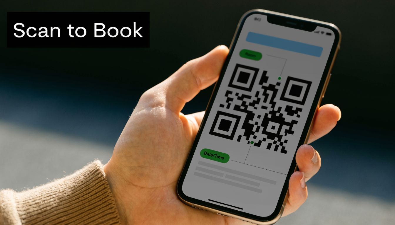
Build this one for the phone screen first, then design the paper around it. The QR code is the main job. Everything else supports the scan.
A layout that works:
- Top: Plain-English headline with one outcome
- Upper middle: Large QR code with clear white space around it
- Beside or under the code: One short line explaining what the scan does
- Lower section: Three trust points, max
- Bottom: Phone number and service area as the backup option
Use headline formulas that promise speed or clarity:
- Scan to get a quote today
- Book your clean in under a minute
- See prices and pick a time
- Scan to check availability in your area
Write the action line like a command, not a teaser. Good examples:
- Scan to book
- Scan for instant quote request
- Scan to see available cleaning slots
- Scan to view recent jobs and request pricing
Skip the common mistake. Do not send people to your homepage. Send them to one action page with one job. Quote request, booking form, or recent-work page. Pick one. If the landing page asks for too much, loads slowly, or looks bad on mobile, the flyer did its part and your process killed the lead.
Here's the mini-toolkit for this flyer idea:
- Best offer fit: Repeat cleans, end-of-lease quotes, office cleaning enquiries, and local area promos
- Best distribution spots: Apartment lobbies, café boards, reception desks, real estate offices, move-in packs, and handouts after onsite quotes
- Best CTA type: Fast quote, book now, check availability
- Tracking method: Use a dedicated page or QR code URL so you can see which flyer version gets scans and bookings
This flyer also works well inside a broader lead generation system for contractors because it connects offline distribution to a trackable online action.
Put the QR code where the eye lands first, not in the footer. Then test it on multiple phones before you print 5,000 copies.
8-Point Cleaning Flyer Ideas Comparison
| Flyer Type | 🔄 Implementation Complexity | ⚡ Resource Requirements | ⭐ Expected Outcomes | 📊 Ideal Use Cases | 💡 Key Advantages / Tips |
|---|---|---|---|---|---|
| Before & After Visual Comparison Flyer | Medium, photo shoots & layout alignment | High-quality before/after photos, basic design tools, minimal copy | ⭐ High engagement & trust through visual proof | Carpet/upholstery, window, pressure washing, deep residential/commercial cleans | 💡 Powerful transformation proof, use consistent lighting/angles and subtle branding |
| Local Service Guarantee & Pricing Transparency Flyer | Low–Medium, legal review recommended | Accurate pricing data, guarantee wording, credentials, testimonial snippets | ⭐ Increased trust and reduced booking objections | Local plumbers, electricians, carpet cleaners, franchise/local operators | 💡 Reduces price friction, include verifiable badges and measurable guarantees |
| Seasonal Service Special & Limited-Time Offer Flyer | Low, scheduling & deadline enforcement | Seasonal imagery, promo terms, tracking codes, limited inventory planning | ⭐ Drives immediate bookings and manages seasonal demand | Spring cleaning, holiday prep, post-winter deep cleans, school/office cycles | 💡 Creates urgency, limit frequency and enforce deadlines to protect margins |
| Customer Testimonial & Social Proof Flyer | Medium, ongoing collection & permissions | Verified reviews, customer names/locations, photos or screenshots | ⭐ Strong credibility for skeptical prospects, higher conversion | Local services, trades, commercial cleaning, client-facing providers | 💡 Rotate real testimonials; always get permission and show name/suburb for authenticity |
| Educational How-To & Service Explanation Flyer | High, requires expertise and clear design | Subject-matter content, infographics/icons, longer copy, possibly video | ⭐ Builds long-term authority and organic reach; slower direct conversions | HVAC, carpet care, window treatment, specialty cleaning services | 💡 Use bite-sized infographics and a series approach; explain "why" to justify value |
| Service Area Map & Local Coverage Flyer | Low, map design & data accuracy | Accurate service boundaries, list of suburbs/postcodes, local credentials | ⭐ Clarifies eligibility and strengthens local trust/SEO | Multi-suburb trade services, regional operators, neighborhood-focused campaigns | 💡 Color-code zones and list suburbs prominently to improve local search relevance |
| Problem-Solution-Benefit Outcome Flyer | Medium, needs customer research & targeted copy | Market insights, persuasive copy, proof elements, clear CTA | ⭐ Highly persuasive; frames service as solution and drives action | Universal, target-specific pain points across services and segments | 💡 Use customer language, quantify benefits, and create versions per segment |
| Mobile-First QR Code & Easy Booking Flyer | Medium, technical setup & testing | QR generator, fast mobile landing/booking page, UTM tracking, fallback info | ⭐ Fast conversion and measurable ROI; excellent for tech-savvy audiences | Flyer-to-booking campaigns, portfolio-driven promotions, younger demographics | 💡 Test scanning and load speed; use unique QR codes per campaign and include fallback contact info |
Putting These Flyer Ideas into Action
A stack of 5,000 weak flyers will not save you. One sharp flyer, sent to the right streets with a clear offer, will beat a bloated campaign every time.
That is the core task here. Match the flyer to the buyer, then build it so someone can act on it fast. If the service sells on appearance, use the before-and-after flyer. If people hesitate because they do not trust cleaners, lead with your guarantee, reviews, or transparent pricing. If timing drives demand, run the seasonal offer. If people need help understanding the service, use the educational format and make the next step obvious.
Do not treat the ideas above like a random list. Treat them like a working kit. Pick one format. Use the layout sketch. Write three headline options. Choose one CTA. Set one distribution plan. That gives you something you can print, test, and improve instead of another half-finished marketing idea.
Distribution decides whether the flyer has a chance. Skip the wide, lazy drop. Focus on the streets, buildings, and business clusters where your best jobs already come from. Run a controlled batch first. Use a unique phone line, QR code, offer code, or booking page so you know which version pulled the response.
Then repeat in the winners. One drop gets seen. Repeated drops in the same area get remembered.
Keep the design tight. One job. One headline. One proof point. One call to action. If the flyer tries to explain every service, every discount, and every reason to trust you, it will do none of them well. Busy homeowners and site managers scan first. Build for the scan.
Print two versions if you serve two very different buyers. A domestic cleaner should not use the same flyer for family homes and office contracts. The pain points are different. The proof is different. The offer is different. Your flyer should reflect that.
Flyers still work for local operators because they put a clear message in front of nearby buyers at the right moment. As noted earlier, physical promotion remains effective when the targeting is tight and the message is specific. That is why the best approach is simple. Start small. Track hard. Reprint winners. Cut losers.
If you want your flyer campaigns backed up by consistent online visibility, GrowTradie makes that easier. It creates and posts branded content for trade businesses, keeps your profiles active between jobs, and helps turn local attention into real enquiries without you having to write, design, or schedule everything yourself.